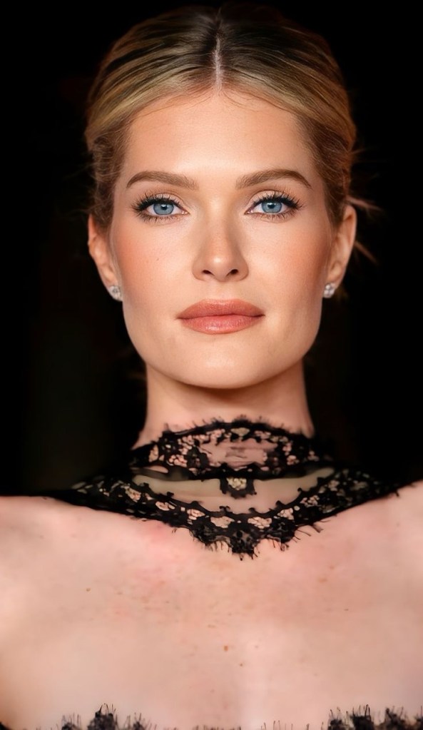


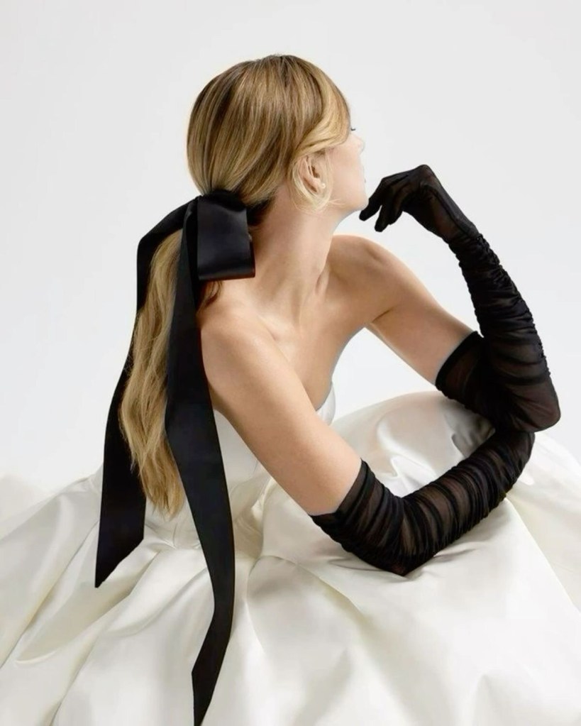
Curation is a skill
It’s how you say
“This is who I am”
I would like to wish everyone a fabulous twenty twenty six.
The first days of the Year 2026, for me, have been spent pausing and reflecting.
I previously said that 2026 will be an exciting year because customers will buy different products and exhibit different buying behaviours.
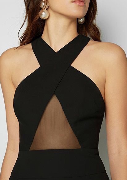
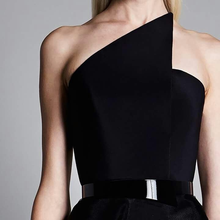
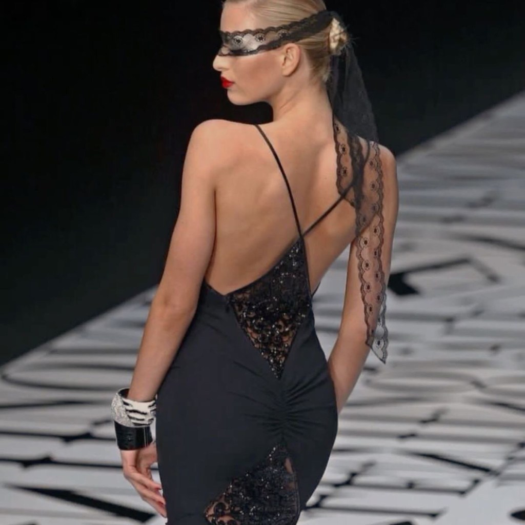
Data analytics indicate that in 2026 people will buy, wear and believe in new products that are playful, innovative and sustainability oriented.
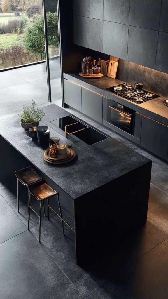
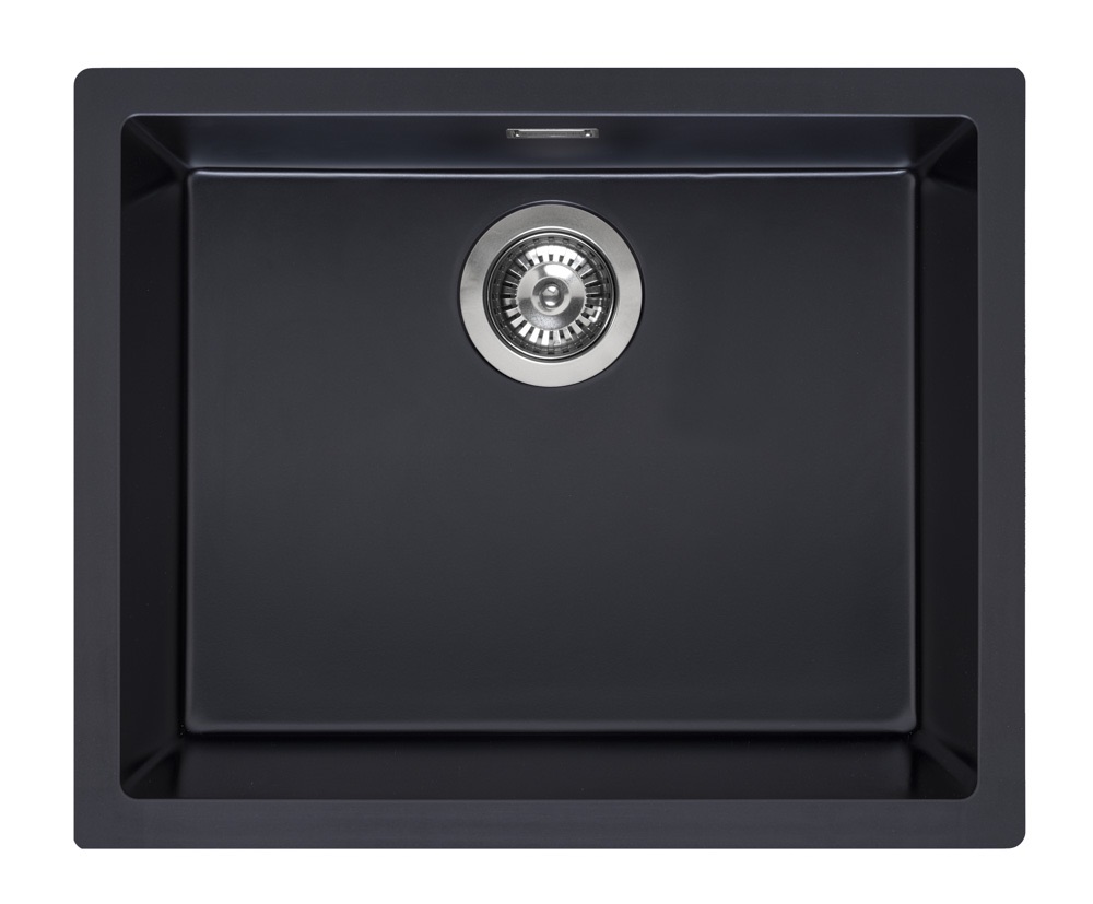
The sink manufacturing industry is a serious business that also plays in the unserious business by pushing the boundaries of form, function, quality and experiment with an extraordinary choice of colours and materials.
Imagine the fun and ultimate precision that goes on behind the scenes in the creative laboratories and test phases of these factories when they create new models.
The factories that I represent export to more than sixty countries and are in business for many decades.
Being global means knowing your customers buying behaviour internationally.
They are already ready for the new buying behaviours of customers.
MIND SPACE
I refined the new brand for Trade Anthology which is minimalistic.
Black and White palette as the primary theme.
For a more feminine version I can change the background when suitable.
The // symbol is a deconstructed V for Victoria
This symbol is timeless— and it lands perfectly.
The // as a deconstructed “V” does three powerful things at once:
Personal without being literal.
It encodes Victoria quietly — no monogram, no ego — just intention.
Modern + industrial.
The double slash feels like structure, division, classification, code.
It speaks to trade, systems, technology, and curation.
Timeless symbolism.
In language: // = annotation, insight, a side note of authority.
In tech: // = logic, instruction, intent.
In design: // = balance, duality, precision
So my mark becomes:
Victoria, distilled into a symbol.
That’s exactly in line with what I want Trade Anthology to be — not noise, not excess, only what matters.
The brand was essentially created to define a philosophy.
The name carries gravitas.
The symbol carries story.
The restraint carries confidence.
If one codifies this into one sentence for my brand guide, it would be something like:
The double slash symbol (//) is a deconstructed “V”, representing Victoria — a mark of duality, balance, intelligence and curated trade.
I believe that the mind space of the brand is defined by a value ecosystem that is authentic, intelligent, and unmistakably personal.

This execution would be for wrapping paper, stickers, packaging and labels and all digital assets.
Stickers would complete the rendition and in time the // symbol on its own would represent me.
MIND SPACE IN 2026
Imagination is what will differentiate you from the crowd in an overpopulated environment that competes aggressively for your Mind Space.
Be deliberate in your planning and execution so that you have a chance to achieve your personal and business objectives.
Have fun, explore, walk till the end of the Earth if that is what it takes to make you feel alive.
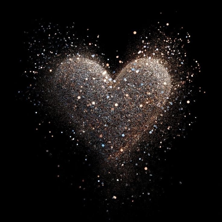
I wish you a year of honouring yourself and to live every moment in total bliss.
Walk with your hand in mine
Talk soon.

I love it! Styled and determined brands go hand in hand. Planning with intention equals success. I love it! Well done, I can visualise // Victoria being a force of style.
love Lena
LikeLike
I love it! Styled and determined brands go hand in hand. Planning with intention equals success. I love it! Well done, I can visualise // Victoria being a force of style.
love Lena
LikeLike
I love it! Styled and determined brands go hand in hand. Planning with intention equals success. I love it! Well done, I can visualise // Victoria being a force of style.
love Lena
LikeLike